Warm vs. Cool Tones: Creating Atmosphere
Getting the difference between warm and cool tones matters a lot when designing wall panels. Warm hues such as red, orange, and yellow bring energy and excitement to a room. These colors work well in spaces where people gather because they naturally boost activity levels and keep folks engaged. On the flip side, cool shades like blue, green, and purple create calm environments that help people unwind. Research from the Journal of Environmental Psychology found folks in warm color rooms generally interact more with others while cool color spaces encourage quiet time and personal reflection. Choosing the right color tone affects how people behave in a space, sets the mood, and helps achieve specific goals for different areas of a building. A vibrant lobby needs warm tones while bedrooms benefit from cooler palettes for better rest.
Emotional Impact of Common Panel Colors
Using color psychology when choosing wall panels actually connects with how people feel about different colors. Take blue for instance it makes most folks feel calm and trustworthy. Red on the other hand gets hearts racing and brings out passion in many cases. Yellow walls definitely lift spirits and spark creative thinking, though going overboard with bright yellows can sometimes make spaces feel too intense. Studies looking at this stuff show colors do more than just change moods they really impact how productive someone feels too. Those lighter blues especially seem to help concentration and creative thought processes, which explains why so many office spaces go for them these days. Designers should keep these effects in mind when picking panel colors. Blue works great in places where relaxation matters most, maybe a bedroom or meditation room. A splash of red might perk up a dining area or gym space where extra energy is good. And those creative corners? Yellow there makes total sense. Understanding these connections helps create living spaces that aren't just practical but actually speak to the emotions of everyone who spends time there.
Expanding Spaces with Light-Colored Panels
Using light colored panels is actually one of the best tricks around for making cramped spaces seem bigger. White, beige or soft gray tones bounce light around better than darker shades do, which creates this nice open feeling throughout the room. Studies have shown time and again that people tend to perceive lighter colored rooms as being more expansive simply because there's less visual weight on the walls. When going for this effect though, don't just grab any old paneling off the shelf. Make sure whatever gets installed matches up nicely with what's already in place downstairs or across the hall. A good rule of thumb? Think about how different materials interact together when selecting finishes so everything flows naturally instead of clashing awkwardly.
Creating Intimacy Through Dark Hues
When it comes to wall panels, going dark really transforms a room into something warm and inviting. People often find that deeper tones like navy blue or charcoal gray create this wonderful feeling of being wrapped up in comfort, which is why they work so well in places where folks actually want to unwind after a long day at work. But there's a catch here too many homeowners discover when their new dark walls start feeling stuffy instead of snug. The trick? Make sure those deep colors get enough light competing against them. Layered lighting makes all the difference here not just overhead lights but table lamps, sconces along the walls, maybe even some candles now and then. This approach keeps things from getting too heavy while still letting those rich panel textures shine through properly.
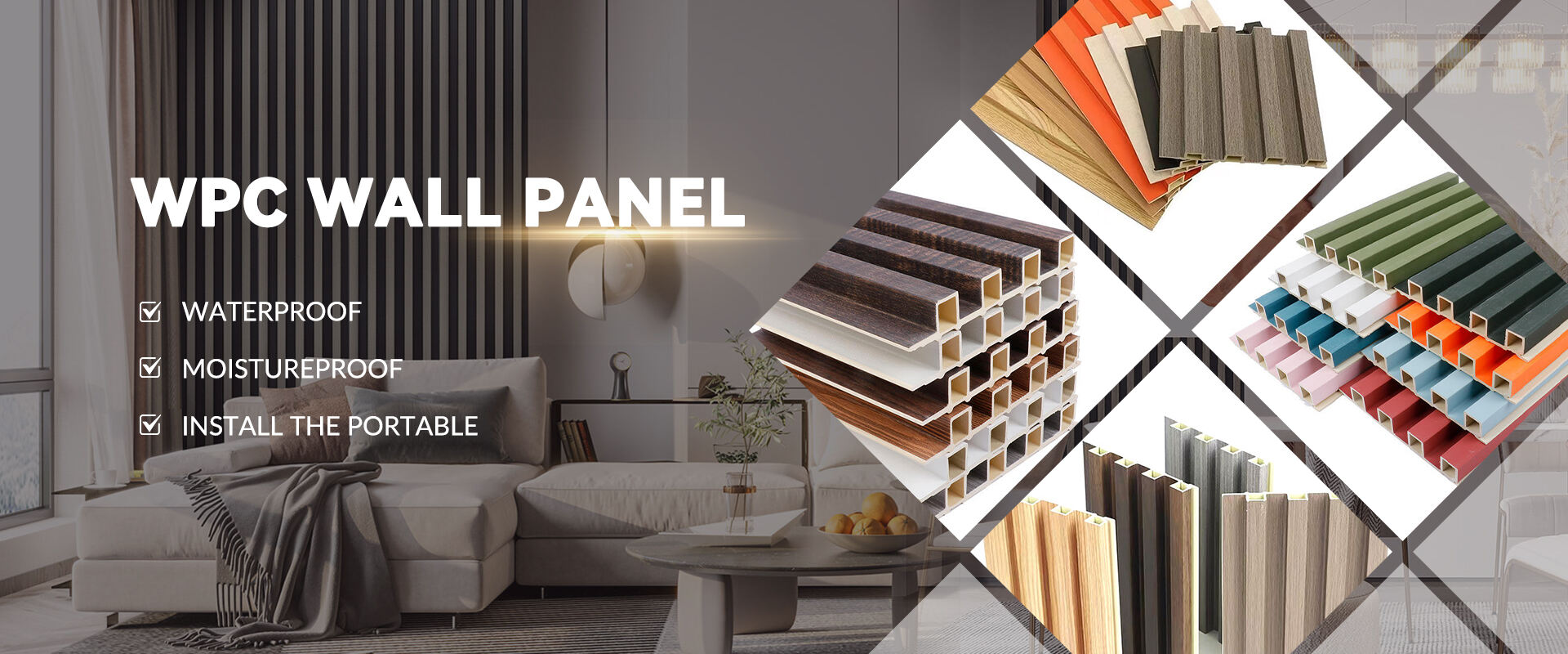
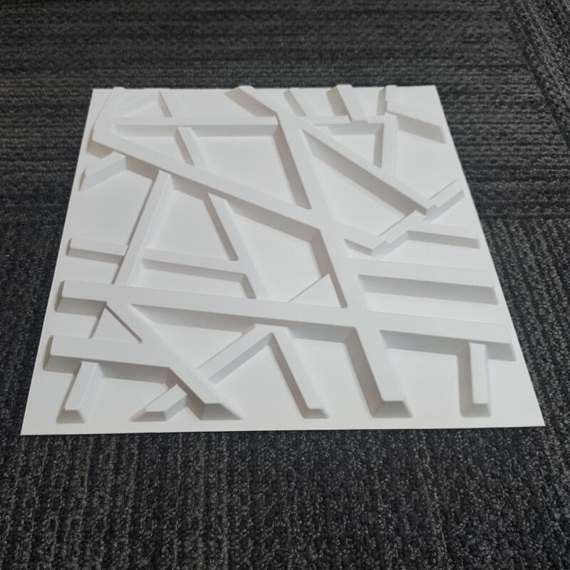
Strategic Use of 3D Wall Panel Patterns
Three dimensional wall panels really change how we think about interior design, bringing depth and dimension that regular flat walls just cant match. The textures on these panels make rooms feel bigger somehow, and they naturally catch the eye when someone walks into a space. Pairing them with smart color choices makes all the difference too. Spaces become more interesting visually but still maintain harmony throughout. Interior designers who work with clients often find that these textured panels help highlight focal points in a room while still fitting right in with whatever style the client wants. That's why so many modern homes now feature them somewhere.
Calming Blues for Bedroom Acoustic Panels
Blue colors tend to be the go to option when designing bedrooms because they create such a calm and peaceful vibe. People often find blues really helpful for winding down after a stressful day, which makes sense why so many folks choose them for their sleeping areas. Some homeowners also install blue acoustic panels these days since they actually work pretty well at soaking up noise, something that matters a lot in any bedroom setup. There was this research about how colors affect our minds while we sleep, and it basically backs up what most people already know about blues helping us relax better at night. If someone wants to add those blue panels without going overboard, mixing them with some earth tones or warm wood elements usually creates a nice balance while keeping that soothing feel intact throughout the space.
Energizing Yellows in Kitchen Backsplashes
The color yellow really brings energy to kitchen spaces, turning them from ordinary rooms into lively areas where people actually want to spend time. People generally feel happier and more creative around yellow, and interestingly enough, studies show it can boost appetite too, which makes sense why so many kitchens go for warm yellows. Think about adding some yellow accents when planning your kitchen design. Maybe start small with decorative wall panels or a backsplash in a bright shade. Pairing those yellows with more subdued colors on countertops and cabinets works wonders for creating balance while still keeping things cheerful. A well placed splash of yellow can make cooking feel less like work and more like fun for everyone sitting at the table afterward.
Professional Neutrals for Office Decor
Professional offices tend to go for neutral tones because they just look cleaner and help people stay focused on work rather than getting distracted by flashy colors. Think about grays, beiges, those soft white shades we see everywhere these days. These colors act like a blank slate where everything else stands out better. The great thing about neutrals is how flexible they are too. Throw in a few bold accents here and there, maybe through artwork or furniture, and suddenly the place doesn't feel so boring anymore. A lot of modern workplaces actually install neutral colored walls as part of their interior design strategy. While maintaining that professional vibe, it still allows room for creativity. But let's face it nobody wants to spend all day in a totally bland environment. So adding pops of color somewhere, perhaps through plants or decorative items, makes all the difference in keeping employees motivated and comfortable throughout their workday.
Natural Wood Tone Resurgence
Natural wood tones are making a comeback in decorative wall panels, showing how people today prefer designs that are kinder to the environment. Looking ahead to 2024, we see more homeowners going for those earthy wood colors that remind us of being outside in nature. Market research shows that sales of organic materials for interiors have gone up quite a bit lately, as folks hunt down those warm, cozy wood finishes that give spaces a rustic feel. What makes wood tones so great is they work across different styles. They fit right in with minimalist Scandinavian looks but also look amazing in old fashioned country settings. No matter what kind of decor someone wants, these wooden accents bring depth and personality to rooms without ever feeling out of place.
Bold Accent Walls with Metallic Finishes
Metallic finish accent walls are really taking off in interior design circles because they just plain make rooms look amazing. When light hits those shiny surfaces, it bounces around in ways that completely change how a space feels. Rooms seem bigger somehow, plus there's this subtle luxury vibe that comes through. Most designers today use these metallic touches carefully though, maybe on one wall or an interesting architectural feature somewhere. The trick is placing them just right so the whole space doesn't feel too flashy. What makes this trend work so well is pairing those eye-catching reflections with more subdued colors elsewhere in the room. It creates balance without losing that modern edge we all want nowadays.
Biophilic Green Tones in Modern Design
Biophilic design is changing how we look at interiors these days, especially when it comes to those cool green walls popping up everywhere. Research from places like Harvard Business Review suggests people actually feel better and work harder when surrounded by green spaces, which explains why so many architects are going green in their projects lately. Take office buildings for instance – some companies have started installing wall panels with leaf patterns and tree branches printed right onto them. These panels don't just look good; they create that calming effect similar to being outside without having to step foot outside. As cities get more crowded and stressful, bringing bits of nature indoors through colors and textures seems to be what people really want now, balancing beauty with actual health benefits.
Testing Samples Under Different Lighting
Getting the colors right matters a lot when picking out decorative wall panels, which is why many homeowners find themselves testing samples in different lights before committing. Lighting makes all the difference really. What looks great in morning sunlight might look completely different under evening lamp glow. Take some time to check how those samples look throughout the day too. We had one customer who thought they picked out the perfect warm beige panel for their living room, only to discover later that under the office fluorescent lights it turned into something much colder and grayer than expected. That threw off the whole look they were going for. Bottom line? Don't rush this part of the process. Spend some quality time looking at those samples in every possible light condition available in the space where they'll go.
Coordinating with Existing Architectural Elements
Matching new panel colors to what's already there matters a lot if we want everything to look cohesive in a room. Grab some color samples and hold them next to walls, floors, maybe even ceiling tiles to see how they work together. Making a quick mood board helps too when trying to picture different combinations side by side. Soft gray panels really pop next to marble countertops and give off that sophisticated vibe. But go too bold with bright colors and they'll fight with older style elements instead of blending in. Think about kitchens where wood tones need warm colored panels versus offices where clean lines call for cooler shades. The best results come from panels that complement rather than compete with surrounding architecture.
Maintenance Tips for Colored Surface Panels
Keeping colored wall panels looking vibrant and lasting longer takes some basic care routines. A simple wipe down with a damp cloth works great for getting rid of dust and grime without damaging the surface. Just steer clear of anything scratchy or harsh on the material. Sunlight tends to fade colors over time, so panels near windows often show signs of wear first. Applying a UV resistant coating goes a long way toward preventing this problem. Many professionals recommend sealing the panels as well, especially those installed in busy spots where they get touched or bumped regularly. With regular attention and proper protection, most acoustic wall panels stay attractive and functional for many years despite daily use.
Table of Contents
- Warm vs. Cool Tones: Creating Atmosphere
- Emotional Impact of Common Panel Colors
- Expanding Spaces with Light-Colored Panels
- Creating Intimacy Through Dark Hues
- Strategic Use of 3D Wall Panel Patterns
- Calming Blues for Bedroom Acoustic Panels
- Energizing Yellows in Kitchen Backsplashes
- Professional Neutrals for Office Decor
- Natural Wood Tone Resurgence
- Bold Accent Walls with Metallic Finishes
- Biophilic Green Tones in Modern Design
- Testing Samples Under Different Lighting
- Coordinating with Existing Architectural Elements
- Maintenance Tips for Colored Surface Panels